

In the crowded aisles of stores, where thousands of products fight for attention, the design of color in packaging makes a significant difference. One key aspect that is often overlooked is color, a vital tool that not only enhances aesthetics but makes consumer navigation and orientation easier. In this article, we explore the importance of color in packaging and how it can influence the shopping experience.
1. Color as a key to product identification
The color in packaging It is a powerful visual cue that consumers instinctively use to recognize products. In crowded retail environments, shoppers rely on color to quickly identifying what they are looking for.
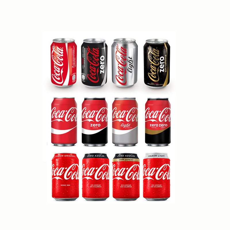
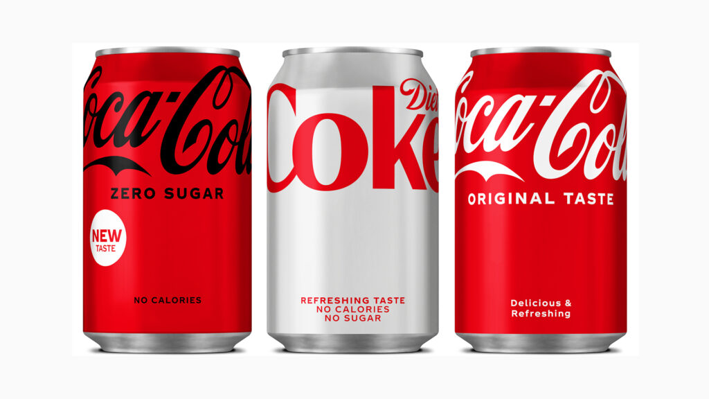
• Brand Recognition: The consistent use of colors in packaging helps products to be easily identifiable. For example, Coca-Cola’s signature red or Tropicana’s green are visually distinctive and reinforce the brand’s identity. This ensures that the consumer immediately associates the product with the brand, increasing their trust.
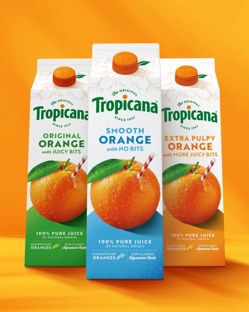
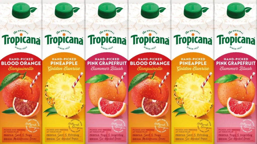
• Differentiation of Categories: Within the same product line, the color in packaging can be an effective tool for separating categories. A clear example is the different flavours or variants of a product, where each option is represented by a different colour. This makes it easier to navigate shelves full of options.
2. Color increases the visibility of packaging on shelves
One of the biggest challenges brands facing is standing out on shelves full of products. Here, the color in packaging plays a crucial role as it can grab the consumer’s attention quickly.
• Contrast and Brightness: The colors in packaging Bold, high-contrast colors increase the likelihood that the product will be visible at first glance. Bright, bold colors on neutral backgrounds can make a product stand out among its competitors.
• Color Block: The strategic use of blocks of color in packaging creates a visual hierarchy that guides the consumer's attention. This approach can also be used to highlight important features, such as a promotion or product benefits.
3. Improving packaging usability and navigation with colors
A good design of packaging should not only be visually appealing, but also functional. The color in packaging It can improve the usability of the packaging, facilitating consumer navigation between different product variants or categories.
• Color Coded Labels: The labels or tabs encoded by color in packaging they help to quickly identify the main characteristics of the product, such as size, flavour or type. For example, “organic” versus conventional versions could have different colours, making it easier for the consumer to decide.
• Highlighted Information: The color in packaging It can also be used to emphasize important instructions, such a how to use, nutritional information, or current promotions. This not only improves clarity, but also optimizes the shopping experience.
4. Color creates emotional connections with consumers
In addition to its functional value, the color in packaging can evoke emotions and generate a deep connection with consumers. color in packaging appropriate can change purchasing behavior and improve brand perception.
• Emotional Appeal: Colors in packaging Colors like blue convey calm and confidence, while red can create urgency or excitement. Choosing a color palette that aligns with the product’s purpose can strengthen positive associations with the brand.
• Brand Personality: The colors in packaging should reflect the brand's identity. An eco-friendly brand can choose green and brown tones to highlight its commitment to sustainability. This consistency reinforces the company's values and improves perception among consumers.
5. Navigating consumer color preferences
The choice of color in packaging It shouldn't be an arbitrary process. Brands that research the color preferences of their target audience have a higher chance of success in their packaging design.
• Market Research: Conduct market research on customer preferences color in packaging can provide valuable information to guide design decisions. This ensures that packaging resonates with consumer expectations.
• Cultural Considerations: The meaning of the colors in packaging varies across cultures, and it's important to take these differences into account when designing for international markets. For example, white, which symbolizes purity in some countries, may have connotations of mourning in others.
6. Practical Tips for Effective Use of Color in Packaging
Here are some practical tips for using the color in packaging effectively:
• Consistency: Maintain consistency of colors in packaging across the entire product line and in marketing campaigns. This facilitates brand recognition and reduces confusion.
• Contrast and Legibility: Choose colors in packaging that provide good contrast between the text and the background. This is key to ensuring the legibility of essential information and facilitating navigation in the packaging.
• Consumer Testing: Don't forget to try the designs of color in packaging with real consumers to get feedback. This can provide valuable insights into the effectiveness of color and other visual aspects of the design.
Conclusion
The color in packaging is a vital aspect of design that directly impacts the consumer experience. A strategic use of color in packaging not only facilitates product identification and improves visibility on shelves, but also reinforces brand identity and creates deep emotional connections with consumers. By taking advantage of the color in packaging In an effective way, brands can improve packaging navigation and create a more attractive and intuitive shopping experience.
If you want your design to color in packaging Use color effectively to improve navigation and visibility, Contact us today. We can help you create solutions packaging visually striking and functional.

